
Welcome back all you freshly mind wiped secret agents to The Webcomics Weekly! We have an eclectic collection of five comics this week, with our two spooky continuations, one returning comic about magic and girls and disillusionment, one adaptation of a famous true crime novel (wait, what?) AND at least one true, blue new webcomic here to usher you into your golden years. That’s right. You’ve been here before. You’ve done this all so many times your hair is grey and Arnold Schwarzenegger has starred in the third remake of Total Recall, Totally Recalled it this Time, My Dude III.1415 Final Mix.
Read on, quick, before the loop closes again.

Golden Years
Parts 1-7
Updates: Infrequently
By Claiborne the Artist
Reviewed by Dexter Buschetelli
“Golden Years” is one of the more unusual series I have reviewed here at Multiversity. It’s not a great comic, it is difficult to even say it is a good one. It has a visual appearance that is rough around the edges, the dialogue is not what one would exactly call organic, and the lettering and layout are messy if I’m being generous.
These are observations made from a critical standpoint, statements about the level of quality based on standards of the medium. Criticism, at its core, is an attempt to objectively grade a work that aims to entertain an audience, a reception which is subjective in its very nature.
For all the legitimate critiques I could make of this series, as a reader I could not stop scrolling through these entries. And “Golden Years” makes you scroll a great deal. Each entry is laid out very long vertically while being largely devoid of content. What hooks you is two specific factors which work in the series favor: its basic premise and its use of color.
“Golden Years” involves an unnamed protagonist who is brought back for a second life by the god Eidmund. As she was a devout follower of Eidmund and also died at a young age, Eidmund offers to resurrect her and even allows her to give input on what sort of body she would like to receive. I won’t spoil the twist here, but despite how simple it is, it is played well for both laughs and intrigue.
Wanting to see where this premise takes the reader will put you on a journey across large negative spaces and well-placed color combinations that are pleasing to the eye, even when the line-work is not. It’s a strange juxtaposition that one would be hard pressed to explain, but put simply it just works. The series has slowly dropped seven installments over the past seven months, but this is one worth keeping an eye on, even if only due to morbid curiosity.

In Cold Blood
Chapters: All
Schedule: Complete
Written by Truman Capote
Adapted by Emi Gennis
Reviewed by Michael Mazzacane
I’m not very familiar with the source material for this strip, In Cold Blood. The closest connection I have to it is Bennett Miller Capote, which was a movie about the writing of the book. The first thing that struck me was the echoes between Emi Gennis art and Adam Kimmel’s cinematography. They are obviously very different, Gennis’ art is black and white cartooning where Kimmel’s is beautifully engrossing full color. Yet both artists use their medium to echo the feeling of, beauty, isolation, and disruptive terror that the was brought forth by the Clutter family murders.
Gennis evokes that feeling through the use of negative and positive space relations. In the early pages as the bodies begin to be discovered, the negative white space is overwhelming. It makes the sparse scenery and figures pop a bit more. Gennis website is well designed in that the body of the post matches the same pure white of the pages which makes the shade even more all-encompassing.
That all encompassing white is contrasted with the pitch black as the strip switches to the murder night, The strip overall tumbles through time (murder night, next morning, the investigation), each with its own style and textures as the narrative shifts. With this being a black and white strip, the use of negative space is inverted as the black becomes all encompassing and minute white spaces pierce through and pop. This is most effective as the murderers are silhouetted in pure white, they do not fit in the frame just like they do not fit in the house.
Continued belowGennis has really just nice and clean line work, something that shows as the investigation gets underway. As the investigators go through the house, everything is given these simple and clean lines and hatching for texture. All of the lines and texture are juxtaposed with the pure black of a page earlier.
This is a beautiful adaptation and strip. Gennis’ flow from scene to scene with the turn of the page develops that feeling of universality. Their use of page design and style gives each segment its own texture and unique qualities while still keeping with the strip as a whole. Everything about this is clearly well considered and thought through.
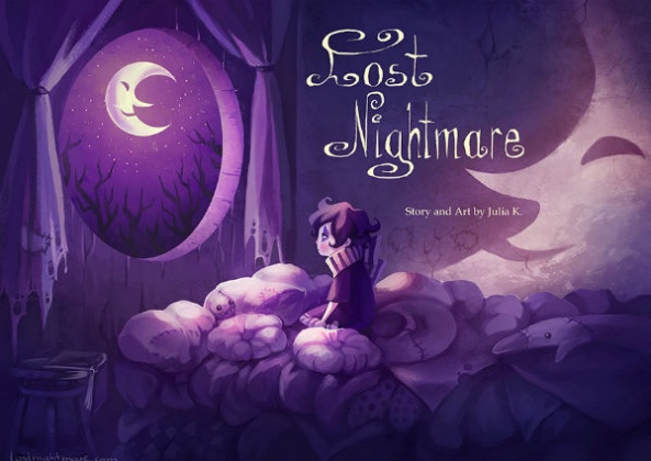
Lost Nightmare
Pages 5.06 – 5.15
Updates: Completed
By Julia K. (a.k.a. Miyuli)
Reviewed by Gustavo S. Lodi
Unfortunately, “Lost Nightmare” update was virtually beret of any actual development and exciting events. If the last set of pages seemed to hint at a faster pace of reveals towards the current nature of dreams, nightmares, Sandman and the Boogeyman, this latest batch simply retreads past waters and does little in terms of innovation or to move the plot forward.
Over at the borders of Sandman’s realm, Jasper and the foxes marvel and are startled by the vast openness of that kingdom, and yet so devastated and empty like a huge desert. By contrast, the darkness surrounding the Boogeyman’s castle looks almost inviting, with characters inside that seem to care about their creations and the impact of their actions.
Talking about the art itself, Miyuli is just as sharp as all the previous pages, with a strong sense of detail to her characters and to the world they inhabit. Backgrounds do look less developed that usual, though, especially on the large set pieces revealing the dream’s desert and the nightmare castle. Colors continue to follow the same style as before, with largely one tone being dedicated to each character and location. It continues to work, but the contrast observed in past entries is missed here, so some pages do look flat by comparison.
Finally, the major flaw on this latest set of pages is how the creator chose to delay major reveals a bit further. At this pace, characters and readers will have figured out the entire story without it actually being shown to either group, which is a pity. In the ambition to keep the guessing going for just a bit longer, the writer loses herself in throwing unnecessary curves towards the series’s audience.
While not a dip in quality, especially in what drawings are concerned, this latest round of “Lost Nightmare” is disappointing given how energetic of a crescendo the latest pages had been. Hopefully that will be turned around quickly when this realm is visited next.

Shattered Starlight
Pages 120-124
Updates: Mondays
By Nicole Chartrand
Reviewed by Robbie Pleasant
Let’s return to the world of world-weary, cynical, young adult magical girls that is “Shattered Starlight.” With plot pieces starting to fall into place, Farah is more or less stuck working with former teammate Aeslinn. Awkwardness ensues.
Although it does make for a great scene where it’s just Farah, Aeslinn, and Fred sitting in awkward silence on the subway. Fred’s cheerful attempts at making conversation are endearing if unsuccessful, and the half-conversation that ensues gives us a little more information about Farah’s powers and why she uses a hockey stick as her magical weapon.
Most of these five pages are just the characters traveling from one place to the next, making awkward conversation and trying not to start another fight between former magical girl teammates. It’s not the fastest paced comic, but it gives us plenty of time to enjoy Nicole Chartrand’s art.
As always, the use of black and white for the mundane world, illuminated only by little things like Farah’s pink hair or Fred’s bright blue eyes, does a great job setting the mood of the comic. The lack of color gives it a somber, mundane, almost depressed tone for the most part, but the little sparks of color (typically for things connected to magic) add a bit of energy and light to it. It’s as if the comic is saying “there is still magic in the world, wherever you can find it.”
Continued belowColor work aside, the artwork is detailed and makes great use of shading. The character designs are distinct and full of personality, and I love the expressions the characters have during the conversations. Seriously, these are some of the best expressions this webcomic has given us, and they add so much to the moment.
While this is just a scene carrying the characters from one moment to the next, we still get plenty of good moments out of it. “Shattered Starlight” continues to do good work with a clever concept, building the world and story one page at a time.

The Strange Tales of Oscar Zahn
Chapters 42-45
Updates: Wednesdays
By Tri Vuong
Reviewed by Elias Rosner
The first thing I noticed about these chapters is the return of the dry humor. Perhaps that is because chapter 43 shifts the perspective back to Oscar for a bit, who seems to be the most lighthearted of all the Cassiopeia-bound characters. His internal monologue borders being overwhelming but the wit of Vuong’s writing and the clarity of Oscar’s voice compensates for the sheer volume of text.
These chapters are characterized by revelations for ‘Stardust and Soliloquies’ and for the greater narrative. First off, we finally have an era for this arc — 1994! Secondly, chapter 42 offer an answer as to the identity of the SOS callers as well as the demons that have haunted him and his radio since we first met him. It is a particularly effective chapter, rendered in scratchy black and white, which provides a great contrast to the brighter, deep blues of the main chapter.
It gives the air of a harsh memory, one washed out with age but no less clear, and therefore, all the more ominous.
The same is true of chapter 44, although the visuals are that of the present day, the content is melancholic. The two crew members of the Cassiopeia are questioning the decisions of the captain and, much like the ship of Theseus, they question at which point they ceased to be human. Have they replaced too much? Has time stripped them of their ability to care and, if so, does that make them relevant anymore?
These questions are contrasted directly with the Captain approaching the island’s fox and, later, with his assertions to Edmund that he is no longer human, something that is reinforced by his actions at the end of the chapter. A chilling place to end but one that also beckons one to keep reading, to find out why the Captain is behaving the way he is, and if that is a sign of things to come.
“Oscar Zahn” has hit its stride with this arc and these four chapters distill all that is great about the comic into them. It is a wonderful showcase of the varying tones and design elements that Vuong is capable of creating, making for a narrative that begs you to continue.


