
We here at The Webcomics Weekly try to keep things light and somewhat out of step with current events. Sometimes we can’t do that. So, before we get on with the reviews, here is an article from Rolling Stone on how to help and donate and two free books — book 1 & book 2 and a free chapter from Sarah Jaffe’s book Necessary Trouble, whose newsletter is Warren Ellis & Kieron Gillen endorsed. Please consider helping in any way you can. As Rabbi Tarfon said in Pirkei Avot: “It is not your duty to finish the work, but neither are you at liberty to neglect it.”
This week, we have “Trekker,” “for love,” “Order of the Stick,” “White Shadows” and “A Better Place.” Stay safe everyone.
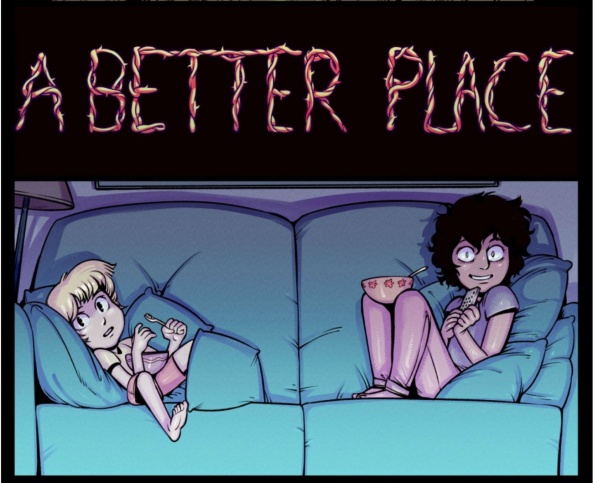
A Better Place
‘The City of Goblets’ – ‘Past that Point’
Updates: Thursdays
By Harrodeleted
Reviewed by Elias Rosner
Tapas has added back in the continuous page to page scroll, as well as keeping the nice, wider screen from the update but made the bottom bar unhideable and the top doesn’t automatically go away when you start scrolling. Two steps forwards, Tapas, two steps back. Wait, three steps forward because EPISODE TAGS ARE BACK BAYBEEEEEEEEE. Oh, wait, third step back, the episode scroll is crushed in the list without opening a third window. *sigh*
Anyway, “A Better Place.” This time, Nina and Arma find themselves in the city that parties all day, where nothing is bad and, to quote ‘Make You Better’s’ tags “#stops_progress #makes_the_future_dull #and_the_moment_bright.” I’m so glad the tags have been restored because Bogosian is a master of these improv micro fictions. Without them, the three story and tonal locusi become two, harming the overall picture and removing a vital piece of the whole. The humor and questions the tags provide frame the pages, and thus the scenes, in new ways that encourage deeper consideration of the narrative, layering it like a triple-chocolate cake.
In terms of the story, these pages mostly hover as Nina and Arma find themselves being sucked into the City of Cups by way of their magic, relaxing ambrosia of sorts. It’s an age old trope, the seductive city that keeps you trapped in stasis by providing a leisurely life, but Bogosian doesn’t dwell on that aspect for more than a couple pages, swifty having Mr. Bun push Tina into sending Theo to give them a kick in the pants. The revolution is beginning in earnest, though what its shape is, I do not know yet.
It’s strange to be praising a lack of information but the unknown details makes this story’s engine run. There are so many moving pieces but they’re less important than the personal connections of the characters. The quest for the keys or whatever is superseded by Arma and Nina bonding beneath a tree, discussing their wishes for the world, and, perhaps, for each other, only to have it interrupted by Theo and the real world, with all its messiness and the necessity for violent action in the face of overwhelming, systemic, and unmoving injustice. The fantasy is interrupted, but is it broken?

for love
‘meeting,’ ‘discussions,’ ‘form,’ ‘poetry,’ ‘surprise,’ ‘dance,’ ‘touch,’ ‘attraction,’ ‘voyeurism,’ ‘home,’ ‘gossip,’ ‘intervention,’ ‘bloom,’ ‘passage,’ and ‘heavy’
Updates: Fridays
By Alan Capes
Reviewed by Dexter Buschetelli
As the resident purveyor of weirdness in this column I found myself searching Twitter for body horror in webcomics and very fortunately stumbled upon the work of Alan Capes. In my search for unusual fare of late I have noticed that the horror genre on Tapas, Webtoons, SmackJeeves, and the like is littered with comics by queer creators dealing with predominantly queer issues as a subtext under a surface layer of monsters, demons, cults, eldritch nightmares, and unsettling creatures. Reading Disorder I immediately became affixed to the visual representations and metaphors of gender dysphoria and body dysmorphia. “for love” intrigues me in much the same way.
Unlike “Disorder” this series does have a much more linear narrative, but it subtly addresses ideas of gender and sexuality in a way that is not overt, but still gives you pause to consider how they factor into the story, as they are an integral part of it. “for love” follows Uriel, Angel of Death, who becomes smitten with a nameless devil who is also nameless in gender. This demon states they change shape “as dictated by whoever I pleasure,” as we are introduced to both them and Uriel, who has many questions about their nature and existence.
Continued belowWhat follows is philosophical, theological, horrifying, and yet very sweet. The two begin a romance that we later learn is not necessarily forbidden by at least Heaven, though frowned on by the Archangel Michael. It is one of several endearing moments in “for love” when he is asked by Gabriel, of Uriel, “are your intentions purely of concern for their well-being, or your own jealousy for someone who does not belong to you?”
“for love” doesn’t just ask questions about queerness and gender identity, it also asks questions about existence, God, and what is truly the difference between holiness and unholiness, and if there even is any. Uriel’s grotesque appearance due to the affliction suffered from helping carry souls to the next world creates a juxtaposition for the angel in love with a demon who has the ability to take whatever form is pleasing to the beholder.
This ties directly into the visuals of the series which flow from biological violations of the mind to soft and heartfelt panels far easier than one would expect such a little-known artist to handle so deftly. Uriel’s many left hands and eyes start this series off on an optical shivers in ‘introduction’ and returns to it in the most recent first page of ‘heavy’ but in between lies many beautiful panels that warmed my heart. I highly recommend checking out “for love” no matter where you lie on the spectrums of gender identity and sexuality. It is a truly fascinating, and also touching series.
Order of the Stick
Pages 226 – 230
Updates: Varies
By Rich Burlew
Reviewed by Gustavo S. Lodi
Every once in a while, even the best strip, like “Order of the Stick” will stumble upon a dud, or at the very least an in-between sequence that won’t connect as strongly as the rest. And although this is unfortunately one of those, it still contains some amusing moments, and a lot of potential for future chapters.
Coming from the strong sequence on the last five pages, the order is now enjoying some R&R courtesy of a case of mistaken identify and misuse of pronouns (yes, really, this is “Order of the Stick” after all). That said, it quickly devolves and escalates leading to some pretty dramatic changes that will surely affect the story for next entries.
What disappoints the most on this one is that it is mostly devoid of the top-notch humor the strip is known for. There are some clever use of dialogue, and the plot is stronger that usual, but the main price of admission is a bit on the thin side.
Regardless, even the worst of the “Order of the Stick” is well-executed and timed. Here’s hoping that the seeds planted within will generate new peaks soon.

Trekker
Pages: 11-20 Book 07 ‘The Babel Cannon’ Part 2
Schedule: Mondays
Written and Illustrated by Ron Randall
Lettered by Ken Bruzenak
Reviewed by Michael Mazzacane
‘The Babel Cannon’ concludes with in the only way it ever could as Randall shows some classic fight choreography and storytelling. Most issues of “Trekker” have a splash page, the credit page, and it makes sense for it to be that way. With the page budget splashes are just excessive and should be used sparingly. However when you have the page turn reveal, this was on an odd numbered page originally, of the titular cannon of massive psychic destruction you kind of need to go big and splashy. The full page does capture the enormity of the cannon and it also clearly establishes the environment for the reader. So that when Mercy and Seva throwdown readers can imagine the environment as they work their way throughout it even as Randall drops it out in a few panels or it is otherwise obscured due to perspective.
The choreography and paneling for the fight between Mercy and Seva just reads as classic in the Hollywood sort of way. You could draw a line between the 1938 Robin Hood to this issue of “Trekker” and the duel from “Lazarus.” Randall doesn’t suddenly turn this into a fight manga, there aren’t speed lines galore nor does his style presage the work of people like Rob Liefeld. It is just a plainly good an readable comic book duel.
Continued belowHow that duel ends is also a bit of classic storytelling that allows the villain to die, the protagonist to fight them, and absolve them of their enemies death. Seva is responsible for her own downfall as she forgets mind her footing. It is all very moral and continues the streak of Mercy being shown as a character of violence, but not lethal violence. Otherwise she’d be a “bad guy” because those are the ones that are shown employing lethal force. It puts her in a liminal and perhaps untenable position.
The positioning is what allows her to, literally, be in the middle of the revolutionary Bolt and institutionalist Paul and make the decision to destroy the magical McGuffin. Randall shows real craft in efficiently setting up this dynamic in the previous pages and allow it to naturally come to a head. The world of “Trekker” continues to expand but it is understood through the small cast of characters that help to ground the sci-fi series.

White Shadows
Pages: 1-6
Schedule: Mondays
By Emily Pearson
Reviewed by Michael Mazzacane
“White Shadows” is a webcomic I discovered through the power of Instagram, creator Emily Pearson is a solid follow in general. What made me curious about the strip though was the manner in which Pearson is syndicating it and how their nomenclature interacts with the medium. They are updating it at two pages a week, but unlike Gleb Melnikov’s “Bloodclot” are deconstructing those pages into something that more resembles a vertical strip. Dissecting a comic page in this way has the curious effect of creating more varied panel shapes compared to most Webtoons I have come across as well as reinforcing a recurring criticism I have with how the form is employed: excessive gutter space.
These two at times dissonant constructions come together that makes for an introductory strip that echoes “Isola” in some interesting formal ways. “Isola” is not the fastest comic out there it is a meditative Ghibli-esque journey. Which is interesting considering the lack of gutter space in that comic and Scott McCloud’s thoughts on how gutter space creates the readers sense of time. The opening dream sequence of “White Shadows” evokes a similar temporality through excessive gutter space, seeming to confirm McCloud’s theory. At the same time the imagery reads as active due to the angular shape of the paneling. That energy slowly transforms into anxious claustrophobia due to panel content. The first strip doesn’t tell you what this series is really about, but it is an interesting example of form.
The second entry in “White Shadows” is more standard as we see the main character, Bailey, go to a comic shop. Here the more traditional panel designs in conjunction with the excessive gutter space prove to be a detriment with panels feeling disconnected. The character acting in this panels, however, is well done and give a life and personality to two character who say maybe 50 words combined. There is even a bit of meta commentary as the nature of proper credit and attribution within comics is brought up.
The synopsis on the Webtoons page tells you what “White Shadows” is supposed to be about. That hasn’t fully been explained in the text of the series, yet. Pearson shows off good overall construction and has a slice of life meets fantasy charm to it.


