Welcome back to The Webcomics Weekly!
The food theme continues as we welcome Jacob Cordas aboard and this week he brings “Magic Soda Pop” to the table. Hopefully there’s enough to share. Meanwhile Elias Continues his journey up the “Tower of God” as well as a look at “Phototaxis.” Meanwhile my trek will never end with “Trekker” as Molly and Mercy’s trip to Avalon Bay is thrown aside but maybe they’re relationship will become something more. The “Agents” journey home concludes with a strip looking at the complicated, adorkable, life of Kendall and how changing a characters dramatic position can give them all the depth and interest they need.
We would also like to highlight an excellent article by Zoe Tunnell on WWAC looking at the 17 year journey of “Questionable Content.”

Pages 394-406(Ch8)
Schedule: Tuesdays and Thursdays
By Mildred Louis
Reviewed by Michael Mazzacane
The Winter Break travel strips appear to come to a close with a look at Kendall’s trip back to a complicated home. Kendall has largely been a side-supporting character among the “Agents,” she’s jus the chill helpful person. On her own we get to see a less self assured, somewhat clutzy, version of her away from her fellow Agents. The Kendall strip is a good example of how just slightly shifting the dramatic circumstances can reveal sides of a character you didn’t know existed. There’s that refrain about how everyone’s always the lead in their story, these strips have shown how effective taking this ensemble and just making them the leads of their own stories can be. With Kendall we get to see a woman who is in that awkward young adult place, not quite old enough to be truly adulted but definitely not a teenager any more.
One of the reasons Kendall has played such a supporting role in the group has been her ability to be the straight woman in the group, the foil for whatever comedy and drama is going on. Unshackled from that positioning, Louis draws Kendall in all manner of emotive range that are just clean excellent moments of cartooning. As a reader it seems that Louis derives so much of the series tonality from their use of lettering, the normal formal considerations continue here, but you could have flat black and white lettering and still get the tone from Kendall’s range of expressions. Silent film acting has this reputation for being too arch and lacking in subtly, because it did for various technical reasons, but the way Kendall’s character is handled in this strip is like great silent film acting and storytelling: purely visual and deep without the real need for words.
All of this puts Kendall in an immediately relatable position even as it fails to fully explain what “complicated” means or her relationship with Amelia. Unlike the other “Agents” we do not see her parents in a meaningful way. The whole point of the strip is she is locked out of her home and instead finds that sorta of warmth in Amelia instead. Of all the strips this one is probably my favorite, it works so well because of how it breaks the narrative routine setup by previous strips and how plainly well executed it is.

Episode 1 – 5
Updates: Mondays
By Raúl Trevino
Reviewed by Jacob Cordas
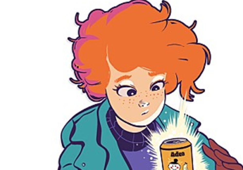
Raúl Trevino understands motion. With a few webcomics under his belt, he has already mastered the energy that comes with scrolling. So often webcomics are simulacrums of comics but, here in “Magic Soda Pop”, he leans into the things that make the form unique, creating a wonderful and exciting experience.
It helps that his art is so luscious. It’s warm and friendly, instantly creating empathy between the audience and our protagonist, Alaina. It makes the heavily relatable teenager-moving-away-from-friends starting point infinitely more evocative – less of what was experienced and more of what it felt like experiencing it and as you scroll through her desperate attempts to hunt through boxes, the feeling of living through this couldn’t help but flood through me.
And it is in the scrolling, this webcomic finds itself. Scrolling through each position of a flawless (or the occasionally awful) dive gives it a kinitecism that floppies can’t imitate. You feel every motion. You feel the fall and, if you are anything like me, you feel awed.
Continued belowThe story so far has only begun to hint at things to come. There is a popular girl that drinks a magical product. It comes from some kind of magic online store that sells sodas that can make you better at all sorts of things. Do you want to be able to dance better? They got it. Do you want to be smarter? They got it. Do you want to be invisible (something I would’ve killed for in highschool?) You better believe they have it. But, of course, there is a price that may be greater than originally anticipated.
It’s classic storytelling that we’ve seen a million times before but feels refreshing here. We can guess at what will happen next. Except that’s not what makes a story like this fun. This isn’t trying to subvert expectations, it’s being the best version of a classic it can be.
With that intent in mind, it is absolutely succeeding. It’s imminently readable with characters that are so intrinsically relatable. Every moment is gorgeous and well considered. Each beat pushes the story forward effortlessly. Character moments hang heavy and sad when they should. But no matter what is being displayed, you don’t stop scrolling. You have to see how well it pulls off each episode. While the main character might need to order sodas to make their life more magical, Raúl Trevino has found a way to make this story preternatural from the start.

02. “To Be Seen” pgs. 115-123
Updates: Monthly in Batches
By Bel by the Sea
Reviewed by Elias Rosner
Cinematic is a term I hate using when describing comics, as if comics are simply storyboards yet to be put into motion or transferred to live action. The only word for “Phototaxis,” however, is cinematic and I am absolutely in love with the choice. Stylized to resemble key frames from animation, complete with dialog and thought coded as subtitles, specifically that distinct yellow used in fan-subs, rather than traditional captions or dialog balloons. Panels take up entire pages, entirely made to fit the wide rectangle of the computer screen, at least on the non-Webtoons version I read. The entire project feels different in a way that only a webcomic can thanks to this.
As for the story, it is slow moving but deliberate; a walk through the woods in the dead of night, alone except for a new companion who seems to barely be there, as if they’re one step away from becoming another piece of the landscaped darkness. These pages feel like the culmination of the chapter, or perhaps the penultimate set of pages, with revelations about the still-unnamed “rouge” and the most direct confrontation with the supernatural. Up until now, or up until the previous set of pages, the horror of the series has been the creeping dread of the atmosphere.
Spooky abandoned places, spooky woods, all of this at night with a mysterious and spooky companion as the main character searches for spiders coupled with the one or two confirmed, or at least hinted at, appearance of spirits, like the hand on the flower from underwater, and despite the lack of anything shocking or in your face, I’m sufficiently sucked in and creeped out. Yet I’m also awed by the wonder of the nighttime. Yes, it’s scary but it’s also beautiful and serene. Bel captures the stillness of a forest at night and how the movements and voices feel amplified by that stillness, as if the dark eats sound.
Bel’s art is shiny and detailed and while I would advise turning up the brightness on your screen to see all the details, there’s something magical about leaving things dark and letting yourself sink deeper and deeper into the mood they create. I encounter few horror series that are this laid back and still able to capture my attention and retain a scary mood without succumbing to shock value, action or overly-comedic “tension-breaks.” “Phototaxis” is unique in that regard and well worth checking out, even if only for the gorgeous lighting they have on each page. A perfect read for the fall.

Tower of God: Season 1 Eps. 16-23; Episode 4 – “The Green April”
Continued below
Updates: Mondays (Currently on Hiatus in English)
By SIU
Reviewed by Elias Rosner
What do you desire? Money and wealth? Honor and pride? Authority and power? Revenge? Or something that transcends them all? Whatever you desire—it can be yours if you climb the tower.
“The Green April” is the first time we’ve had a test last more than one episode. Since the creators are adapting around 6 chapters to every episode, this isn’t surprising and, in fact, I wondered if the anime had to expand the scenes in order to stay at that pace. Turns out, the opposite is true and Tower of God drastically cuts down on the events of “Tower of God,” removing whole sections of exposition and entire characters’ speaking lines, shifting around events so that I think I read a whole fight that’s technically in episode 5 but because a pivotal reveal did not happen yet, I kept reading.
Remember that asshat with a gun who got dunked on in episode two but not in the comic? Yeah, he’s part of the team that attacks Khun and Co. in chapter 21-22, despite no longer being in the anime. It’s a minor change but considering how much I dislike the character, a good one.

This gets to one of the places that “Tower of God” has the potential to be better in the long-run, thanks to it being a Webtoon. For example, 6 people can all talk “at once” in the same amount of space and time as it takes for one person to talk in the show. When the three teams are preparing to steal the crown from the chair, the anime can’t have them all talk over each other but in the comic they can. They can also talk far more extensively without breaking the flow since the time it takes to read two sentences in one’s head is far shorter than reading those lines aloud. Because the Webtoon can use space for dialog rather than audio, more characters and details can be included, which means that as the cast expands, it’s able to and has already done the work to make them feel included, such that later arcs can be more personal for the wet noodle of a main character, Bam.
Tower of God cuts the character’s speaking lines down to preserve the time, especially since the whole fight with Khun is in the final four minutes of the episode. The pros are that the fight is far snappier and isn’t bogged down in your standard “Action-reaction-commentary” cycle of shonen/superhero fights. The cons are we lose some of the characters’ strategies and thoughts, as well as their damn names, in favor of a quicker and far more entertaining fight. The anime makes up for this by infusing facial expressions, vocal performances, the music, and environments with the lost exposition of motives, communicating them far more effectively.
I know I say this a lot, and it’s not exactly fair to the webtoon, but the anime crafts the narrative more succinctly and consistently than the webtoon. Character motivations are clearer, or when they’re deliberately obtuse, it’s easy to tell something more is going on. The sense of drama and the weight of the competition is more present in every aspect and, most importantly, the show trusts its audience to infer from the information given and trusts itself to convey that information effectively.
SIU in these early chapters trusts, it seems, neither, and so they front load exposition and overload us with explanations and descriptions instead of letting the art and speak for itself. That’s a fine technique for a comic with art that, truthfully, requires much of it, but it would be a glaring flaw in the show to simply reproduce it. That doesn’t mean it doesn’t happen, just that it’s far less common Looking at you, Shibisu’s Bendis dialog during the “Anaak gets all murdery at Bam” scene.

There are some other differences between these chapters and the episode which come down to SIU not really being consistent with his characterization, like Hatz threatening Laure for not participating, Khun doubting himself, or Rak not chomping at the bit to go fight in round two and Khun having to bribe him to wait one round because strategy. Others, like Lero Ro invoking Yuri or Laure being the only one to explain the “which round to enter” strategy, are details that change the dramatics of a scene and what is accomplished, with the latter being used to show Khun’s strategic mind as well as make it a less static scene. Again, it works well in the Webtoon but TV requires something different.
Continued belowThe biggest change between the two is the aforementioned final fight. A whole chunk of back and forth exposition is cut (thankfully) and the fight after Khun throws the “real” crown between everyone doesn’t happen. . .yet. I presume it was switched because the episode had to end and it’s a far more effective image to have Bam suddenly be sitting on the throne, with Khun pulling the crown from his bag and looking smugly at the other crown the rest of the characters were just fighting amongst themselves over. That and he didn’t straight up monch a character with his bag in Tower of God, which. . .I dunno if it’s a good or neutral adaptation choice but it’s certainly noteworthy.
Oh, and Rachel’s betrayal speech in the comic is a lot more forceful and out of nowhere, as well as her centrality being lessened. I wonder if that’s an important change or not. Maybe we’ll find out next time in “The Crown’s Fate.”

Pages: Book 12 “The Train to Avalon Bay” Part 3 Pages 17-24
Schedule: Mondays
By Ron Randall(story and art), Jeremy Colwell (color),Ken Brunzeak(lettering)
Reviewed by Michael Mazzacane
While the previous entry in pushed “Trekker” into some different aesthetic grounds part 3 of ‘The Train to Avalon Bay’ ironically puts the series back on tracks as Randall does all the things you’d want and expect a third entry to do. That narrative security is nice considering the titular train is no more maybe Mercy and Molly will get to go to Avalon Bay on a date some other time.
Despite seemingly always talking about lettering in 2000 AD strips and elsewhere, it has rarely come up on this trek. The lettering in “Trekker” hasn’t been poor, it’s workman like and gets the job done. The same holds true for Page 17 of ‘Train to Avalon Bay,’ however, it is what the lettering is in service of that sets it apart. Letterer Ken Brunzeak uses Randall’s script to effectively bisect the page, separating into the panels with Mercy’s inner thoughts and the pertinent expositional questioning that bursts out of her with the fury of our put upon Trekker. Brunzeak’s lettering really makes both the page on a macro level and create the exhausted tone that is running through Mercy. As it turns out Trass is a man who knows too much and his ex-friends would like him not to tell, it’s a pulpy setup perfectly fitting “Trekker.”
This batch of pages also marks a not so surprising turn of events as Mercy and Molly land on top of each other as Hollywood male heroes and their female love interests tend to do in these kinds of things. It’s the clearest coding of Mercy and Molly as romantic partners beyond their friendship we’ve had thus far. Having started reading his latest “Trekker” strip, ‘Hunter’s Moon’ they do become more eventually so it’ll be interesting to see how this adventure affects things.


