
There’s a lot to cover on Wednesdays. We should know, as collectively, we read an insane amount of comics. Even with a large review staff, it’s hard to get to everything. With that in mind, we’re back with Wrapping Wednesday, where we look at some of the books we missed in what was another great week of comics.
Let’s get this party started.

Written and Illustrated by Amy Reeder
Lettered by Gabriela Downe
Reviewed by Quinn Tassin
After a 34 years, Amethyst finally has her own ongoing series once more! “Amethyst #1” is a solid, promising showing for triple-threat Amy Reeder. The issue follows Amy Winston, who found out that she was really Princess Amethyst of Gemworld at age 13. The first few pages do a good job at explaining her backstory of overthrowing Dark Lord Opal, who killed her parents and becoming ruler of the Amethyst Kingdom of Gemworld. After celebrating her 16th birthday on Earth with her adopted parents, Amethyst returns to her kingdom, only to find it in ruins, without a single person around. Stranger still, when she visits her allies in House Turquoise, she’s treated like a stranger and normal townspeople are suspicious of her. Unsettled by the new status quo, Amethyst resolves to go to the Sapphire Kingdom to find out what’s going on and she’s joined by a warrior named Phoss who rides around on a giant caterpillar.
The real selling point on this book is the art. Reeder has always been a wonderful artist but the landscapes of this fantasy world help her really let loose. Just look at that first spread of Gemworld- it’s vibrant and beautiful and filled with all the wonder that a fantasy world should be. Her panel construction is also really strong here- it’s not form-breaking but it slightly shifts normal formatting in ways that make the pacing feel more exciting than it might otherwise. The page where Amethyst leaps from floating stone to floating stone to get to her husk of a palace, for instance, has a small, parallelogram panel that just shows Amethyst’s foot make contact with one of the stones; it helps connect things in a fluid way that makes the page feel just a bit more cinematic.
All in all, “Amethyst #1” is a pretty straightforward issue more concerned with place-setting than anything else. To be fair, the place-setting is good! This is an interesting situation to throw our hero into and I’m certainly intrigued to see where things go. What’s lacking in story here is also made up for in strong characterization and absolutely gorgeous art. The last page of the issue shows us the Dark Lord Opal musing about Amethyst’s return and the fact that her parents are still alive. It’s a solid twist and certainly makes for a good incentive too come back.
Final Verdict: 7.0 – “Amethyst #1” is a solid, promising debut even if it’s missing a little magic

Written by Zeb Wells
Illustrated by Dylan Burnett
Colored by Mike Spicer
Lettered by VC’s Cory Petit
Reviewed by Kevin M. Gallagher, Jr
“Ant-Man” #2 continues where the previous issue left off; Ant-Man and Swarm facing off against the bug men. These creatures made of hornets (Vespa), silkworms (Thread), and beetles (Tusk) want Swarm because their master needs him to make another tool to give life to more bug men. Although Swarm was once part of the Nazi Party, he has no desire to help the bug men and their master, Macrothrax, turn the world of man to the world of bug.
The main plot of this run, ‘World Hive’, is getting interesting, but it’s the side plot of Scott Lang and his daughter, Cassie, that is itching to get to the foreground. In “Ant-Man” #2, we discover that Cassie was invited to join the West Coast Avengers. Her mom, Peggy, argues in favor of Scott, saying how much he’s risked to not just be with her, but fight crime with her as Ant-Man and Stinger.
Zeb Wells’s writing is great in “Ant-Man” #2, especially with dialogue. The interactions involving Ant-Man and Swarm are funny, as is the scene with Cassie and Peggy—how proud Peggy sounded when her daughter said she received an offer to join the Avengers, only to be less enthused when Cassie reveals it’s the West Coast team is a highlight of the issue.
Continued belowThe overall story Wells is telling is less thrilling, but definitely a fun, silly adventure. I think the fun and silliness of the story and dialogue take away from both the seriousness of Macrothrax and the drama between Scott and Cassie. It’s exciting to see the story move forward and likely have Ant-Man and Stinger team up against Macrothrax and his bug men, I would love more of Ant-Man and Swarm in the future; their team-up gives off a heavy Spiderman/Deadpool vibe.
The art in “Ant-Man” #2 matches Wells’s writing almost perfectly. Dylan Burnett captures both the silliness of the story and the horror of villains in a Saturday morning cartoon kind of way. It feels like this issue belongs in the same block of X-Men: The Animated Series and Spider-Man: The Animated Series.
The way Wells and Burnett delivered “Ant-Man” #2 makes me wonder what this series would be like if it were from Cassie’s point of view. The writing and art go hand in hand with a story featuring a younger lead as its main character.
Final Verdict: 7.6 – “Ant-Man” #2 is a fun, silly adventure that is well written and drawn. However, the story needs to bring Scott and Cassie together soon—that’s the story the should be at the heart of this series—family drama is more interesting than bug men.
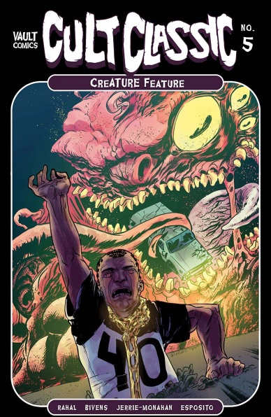
Written by Eliot Rahal
Illustrated by John Bivens
Colored by Jerrie & Monahan
Lettered by Taylor Esposito
Reviewed by Kobi Bordoley
We noted that Vault was a 2019 publisher to watch, and the finale of Cult Classic: Creature Feature has cemented that feeling with its gooey, alien ooze. “Cult Classic: Creature Feature” #5 is raw and freaky, which is our way of saying that the evil ETs vomit the skeletons of their victims, turning them into flesh eating hunters (among other things). And boy, do they hunt. This is Dazed and Confused meets The Faculty meets The Evil Dead. Really, this is a veritable 10 car pile up of pulpy horror tropes and unbridled Americana. Let’s step through the carnage and get under the hood.
Eliot Rahal knows this territory well. Alien Intrigue is his bread and butter, and Rahal certainly serves us our lunch with “Cult Classic: Creature Feature” #5. Hel paces the story well, which is important in a short, five issue miniseries. Plot points and important conversations happen quickly, but the turn-on-a-dime switches from exposition to arc culminating, emotional conversations never feel cramped. Rahal lets everyone have a moment of heroism. Nobody’s extraneous in this story, which is satisfying.
The art team crushes it in “Cult Classic: Creature Feature” #5. The panels have that retro-pixelated, 80s drugstore comic finish while maintaining a modern, crisp color palette. Bivens and his co-conspirators know how to dip into nostalgia and then pull back into their own constructed world in a blink of an eye. Esposito, surprising no one, letters like a madman. When monsters scream in Cult Classic: Creature Feature, you hear them loud and clear. Cheers to you, eldritch lake monster (talking about the antagonist in this story, not Esposito, by the way).
All in all, “Cult Classic: Creature Feature” #5 is a satisfying, full-belly conclusion to the miniseries. Something tells us we’ll be back in the town of Whisper some time soon — there’s just too much good stuff here. And besides, we all know that when it comes to tentacled outer space entities, what is dead may never really die.
Final Verdict: 8.2 – Gasoline, grit, alien terror: Creature Feature is a buttery popcorn, all american fight for survival. Bring it on.

Written by Cullen Bunn
Illustrated by Jesus Hervas
Colored by Juancho “Juancho!” Velez
Lettered by Dave Sharpe
Reviewed by Gregory Ellner
The tale of “Dark Ark” has ever been steeped in myth and legend. Keeping antediluvian monsters safe for after the Great Flood of Abrahamic faiths on behalf of quite literally diabolical forces. The horrors of having to deal with the flood itself, as well as being trapped with man-eating beasts of at times human-level sapience. However, with the dawn of the second series, “After the Flood,” Cullen Bunn delves deeper into another type of monstrosity: humanity. As monsters turn against the humans in the absence of the most prominent leader amongst the latter, Shrae, paranoia comes to the fore, especially with the inclusion of another malevolent, manipulative individual to add to the mix. There isn’t a lot of blood or gore, but Cullen Bunn nonetheless crafts a story entrenched heavily in intense foreboding and suspense teetering just on the edge of violence.
Continued belowJesus Hervas has a subtle, intense style to his artwork, focusing in on facial expressions and various perspective shots to tell the story when Bunn uses less dialogue. In the absence of narration boxes, Hervas’s use of shadow to emphasize malicious beings or his close-ups on faces help to tell the emotions, whether faked or true, of every character, from the antagonistic to the more peaceful, creating an atmosphere not unlike Mads Mikkelson’s performance in NBC’s Hannibal would for live action television.
Juancho Velez provides intense, excellent colors throughout, from relative mundanity of a dark ocean and orange sunrise to the fantastical, brilliant colors of manticore fur or other monsters’ green skin or gray horns, all in contrast to the warm, almost offensive coloration of an antagonist’s clothing or the cool, more subdued ones of most of the humans. The use of a red outline, almost an aura, around certain people helps to enhance the sense of their menace, while other times it is merely used as a means of cutting them apart from the darkness of the night, with the angles of the colors’ edges acting as the distinguishing factor between the two as much as the distinct hues themselves.
Final Verdict: 7.0 – Though not much happens up front in “Dark Ark: After the Flood” #3, tensions rise nonetheless through the efforts of the entire creative team.

Written by Simon Roy and Daniel Bensen
Illustrated by Artyom Trakhanov
Colored by Jason Wordie
Lettered by Hassan Otsmane-Elhaou
Reviewed by Luke Cornelius
The first issue of “Protector” left Mari and the robot in the desert midway through its page count so it is fitting that this issue checks in with them first. What Roy and Bensen do in the first half of the book is give the robot a wealth of personality in addition to giving us an understanding of the robot. With the comic’s title being “Protector,” this reviewer expected the robot to live up to this role with little agency akin to Robot in Lost in Space. Instead, the robot is very human-like in its dialogue and behaviour which is a welcome surprise. It’s sarcasm suggests it is friendlier than its metallic, human eating exterior does, but the writing duo also inject a sense of cunning that leaves us unsure whether it is trustworthy. The scriptwork remains successful for almost the entirety of issue #2, with a moment of confusion only occurring when a Yanqui celebrates their “freedom,” because the liberation of Shikka-Go occurs outside of the narrative.
Trakhanov’s artwork serves the robot very well and utilises the entirety of its design in the opening pages, with the robot’s body language naturally alternating between its larger and shorter arms. Moreover, each character is defined through dramatic facial expressions that support Roy and Bensen’s dialogue and further the storytelling of “Protector” #2. This is most clearly seen with First Knife; when arriving at the destroyed Deva, there’s a lightness to his face, in part due to the daytime setting, that gives him an openness that pairs well with his revelatory conversation about the origins of his name. Later when he arrives at Shikka-Go, his expression is frequently covered in dark shadows that makes him look determined and violent. Wordie’s colors are equally pivotal in the storytelling in the book because they help us navigate through the chaotic events in the final pages by washing the different tribes entirely in their chosen colors. Each tribe is easy to quickly identify which makes the action flow. It is only when this abstraction is removed for a page that the narrative gets distorted. Otsmane-Elhaou’s lettering helps the fluidity of the book too.
Overall, Roy and Bensen provide an interesting return to the world of “Protector” that continues to intrigue, with the combination of Trakhanov, Wordie and Otsmane-Elhaou in the art department making for a well told story.
Final Verdict: 7.3 – “Protector” #2 delivers a somewhat subversive script with energetic artwork that is only slightly marred by a pair of missteps.

Written by Christopher Hastings
Illustrated by Ryan Browne
Colored by Ruth Redmond
Continued below
Lettered by Hassan Otsmane-Elhaou
Reviewed by Joe Skonce
There’s something special about a well written “odd couple” dynamic. It’s just fun to see two opposing personalities try and make it work, arguing and struggling, but hopefully finding common ground. In this regard “Quantum & Woody” #2 works wonderfully. Quantum and Woody are a classic mismatched pair. Quantum is a no-nonsense tactician, interested in saving people quickly and efficiently. Woody, on the other hand, is free-spirited and something of a goofball, interested in making the superhero biz stylish and media savvy. In issue two, their dynamic screws up a rescue royally. The overall message of the story, from a very helpful mentor hero, is that both dynamics are important in balance with one another. Quantum’s skills at planning will prevent them from botching missions, while Woody’s showmanship will give them exposure and potentially more legitimacy. If you’re going to be stuck together, you might as well use your strengths to your advantage. Christopher Hastings does a good job of making them feel like brothers. They love each other, but both can get frustrated pretty quickly.
While the dialogue of ‘’Quantum & Woody” #2 was good, the art helped to give the comic something of a heightened, almost absurdist feeling. This was especially true of their villain Dr. Toilet, (or, I’m sorry, Twah-ley.) Dr. Toilet design kept becoming more absurd over time, starting as an elaborate headpiece only to discover a face that felt reminiscent of Mars Attacks. By the final fight, he has mind-controlled half a zoo, creating a monstrosity that just felt right for this comic. Ruth Redmond’s colors also helped to make Toilet’s designs memorable, the flowery headpiece at the beginning was a wonderful treat of colors. The action in the book was also memorable, with Quantum and Woody struggling to keep their balance on the ice, while the mind-controlled skater had control. Her movements felt fluid while the world’s worst superheroes looked shaky and off-kilter. The art and the script work well together, presenting a heightened world to match the heightened personality of the odd couple at the helm.
Final Verdict: 7.3 – “Quantum & Woody” #2 is a story about balance, which successfully balances humor, heart, and fun art.

Written by Donny Cates
Illustrated by Lisandro Estherren
Colored by Dee Cunniffe
Lettered by Joe Sabino
Reviewed by Matthew Blair
Southern gothic stories are one of my favorite sub genres of literature. It’s a genre that has the unique ability to mix well mannered, incredibly rich, high society with crass, poor as dirt, lower class people in ways that would seem awkward anywhere else.
Throw vampires into the mix and you’ve got yourself a recipe for a bloody good time.
Even if you know nothing about the Redneck comic book series, “Redneck” #26 is still a very accessible book. Writer Donny Cates continues to showcase his talents in the horror genre by having one of the oldest vampires in the story setting deliver a grand and epic history lesson to the book’s main character, a relatively young vampire named Bartlett Bowman. It’s a history lesson that should be immediately familiar to anyone who is a vampire fan, but the delivery, paired with the palpable class tension between the older, richer vampires and the young and poor Bowman, makes the whole issue an engaging read.
The artwork also does a grand job of enhancing the atmosphere of the comic. Artist Lisandro Estherren’s rough pencils, coupled with Dee Cunniffe’s minimal colors, combine to create a book that looks gritty, sketchy, and nasty. The closest thing I can think of is if you took Mike Mignola’s style and subject matter, threw in a dash of Jeff Lemire’s art, and spattered the pages in blood, you’d get a pretty goo approximation of “Redneck” #26.
“Redneck” #26 is a classic and very familiar vampire history lesson and introduces the book’s main character to world of privilege, money, and power that he is probably not used to. It will be interesting to see how both of them react to each other.
Final Verdict: 8.7 – If you like vampires, this is all information you’ll know but it should be interesting to see what happens next.
Continued below
Written by Matt Fraction
Illustrated, Colored, and Lettered by Chip Zdarsky
Reviewed by Jodi Odgers
“Sex Criminals” #27 continues the progression of ‘The End’ – the aptly-named final arc of the series. It starts with a moment of levity between Jon and Suzie. After that, as Fraction himself eloquently puts it in the letters section, the rest of the issue is filled with ‘PEOPLE TALKING ABOUT PLOT and DOING PLOT-Y things’. Sex Crims is going to end soon, friends. #27 is one of the last few wild rides that Fraction and Zdarsky will take us on.
The irreverent, utterly unique tone of the series shines through ‘Sex Criminals’ #27 as strongly as it has throughout most of its run. Jon, Suzie, and the rest of those imbued with sexual powers (if you didn’t know that, why are you reading a review of the 27th issue in the series?) continue to be remarkably human, a testament to Fraction’s strength as a writer.
The art style that Zdarsky has created remains remarkably efficient. The simple linework and coloring serve to deliver the character moments as quickly and clearly as possible. This engages the reader right from the marker-filled beginning until the ominous end.
Reading “Sex Criminals” #27 is like having great sex with a partner who will soon move away – you know that this all will end, but you can’t help but squeeze every last moment of enjoyment out of it until it all blows up in your face.
Final Verdict: 9.0 – Fraction and Zdarsky continue to show the power of a strong vision and drawing penises on things.

Written by Brahm Revel & Ronda Pattinson
Illustrated by Brahm Revel & Jodi Nishijima
Lettered by Brahm Revel & Shawn Lee
Colored by Brahm Revel & Ronda Pattinson
Reviewed by Michael Govan
The IDW run on “Teenage Mutant Ninja Turtles” has been great all around but one of the things that I appreciate most about it has been the strong characterization of its characters. Time is devoted to exploring the characters within the pages of the main title and there have been multiple mini-serieses and one-shots released for the express purpose of showcasing a character. This issue, the first in the latest mini-series, does exactly what it sets out to do. It’s a fantastic showing for the latest ninja turtle and Jennika has never been more interesting.
Brahm Revel handles the entire main story himself, from writing to lettering to every single aspect of the art. The creator’s contributions to this comic cannot be stressed enough and he truly does make Jennika shine. In this comic, we get a look at her ‘secret origin’ and her troubled past. We’re shown how Jennika has a kind heart, not just policing Mutant Town but stopping to talk with its residents. We see her skills as a ninja in some engaging chase scenes and fight scenes. We get a look at her interests, the Ninja Turtle loving rock and roll concerts. It’s clear how cathartic dancing around in the mosh pit is for her, how for just a moment she can truly relax and be happy.
Most fascinating, we see how much she’s been struggling with her mutation. Jennika might have kept her life, but just look at how much that life has been flipped upside down. She was dating Casey Jones but now that’s in the past and the distance between the two can’t be ignored. Throughout the comic, we get glimpses of the rage she feels and the desire she has to be human like she was. The panels where Jennika stares at a billboard with a beautiful human model on it with sadness and longing are absolutely heartbreaking.
The back-up story also does more to explore the character, showing us some of her time in prison and the deep impact that Master Splinter had on her. The other Ninja Turtles may not exactly be her brothers, but Splinter was definitely a surrogate father for the ninja. It’s refreshing to see her take the lessons he taught her and pay it forward. A fun, engaging comic and a great read from start to finish.
Continued belowFinal Verdict: 8.0 – If you were ever on the fence about Jennika, this is the comic to win you over.

Written by Steve Orlando
Illustrated by Max Raynor
Colored by Romulo Fajardo Jr.
Lettered by Pat Brosseau
Reviewed by Alexander Jones
Wonder Woman can’t catch a break. After being pursued by the Police Department in the last issue Diana just started to relax when she caught up with a warrior from another time named Valda. It doesn’t appear that Diana’s problems are going to be solved anytime soon considering that writer Steve Orlando has been seeding villains who are still lurking in the shadows of the run. Plus, Orlando even ends this issue teasing a different threat for Wonder Woman to go up against. Orlando is spinning a few different plot threads in the issue and shows how Diana is getting acclimated to her new home. It is fascinating to see how Orlando has already begun establishing a different supporting cast and a new base of operations for the Amazon.
Artist Max Raynor does a great job fitting in with artists from recent Wonder Woman issues including Jesus Merino and Jan Duursema. With so many different interior artists contributing to “Wonder Woman” it is refreshing to see colorist Romulo Fajardo Jr. stay on the title and lend a sense of visual cohesion across the different issues. Raynor’s pencils are much more animated and expressive than previous artists. The way Raynor draws Nora Nunes is particularly loose, showing some differences between the different interior artists in the issue. Wonder Woman still looks elegant and regal in the pages. Diana has body language that is different from the other cast members which serve to differentiate her as a character from a visual standpoint.
While the core plot point with Valda is endearing in this issue, I would really like to see Orlando start to get more ambitious with this script for “Wonder Woman.” Orlando is already teasing several different groups of rogues that Wonder Woman is fated to go up against in future issues, but it can be a little frustrating to have two issues in a row that come dangerously close to being considered filler. With more focus and a concerted effort towards seeding upcoming conflicts in the issue, I think Orlando is already headed in the right direction for his ongoing “Wonder Woman” run.
Final Verdict: 6.5 – “Wonder Woman” #752 depicts Diana acclimating her supporting cast to the modern world and seeds greater dangers lurking in the cracks of the issue.


