It’s that time of year! The Multiversity Year in Review is here, and from now until Thursday, December 22, we will be talking about favorites in a variety of categories. Let us know what we missed in the comments!
3. Matt Wilson

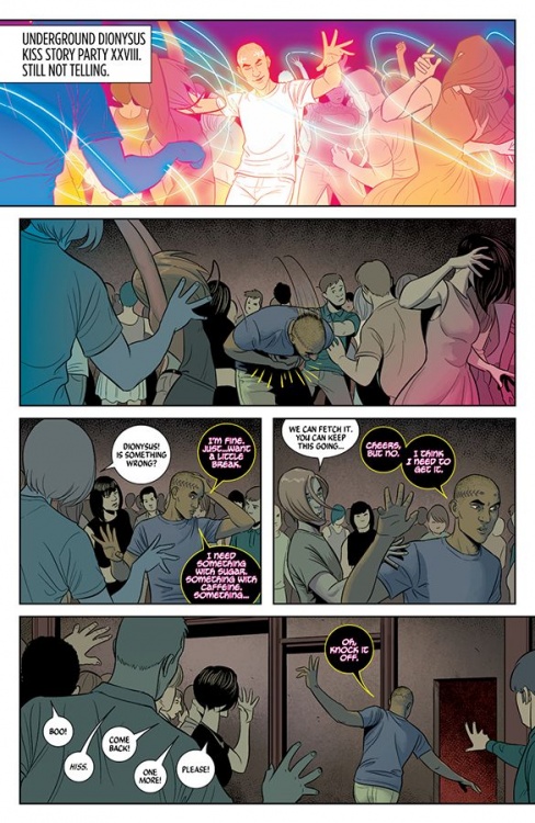
(Jess Camacho) In 2016, Matt Wilson continued to prove why he’s one of comic’s best colorist. His work on “The Wicked + The Divine” has given that book a look that I cannot imagine anyone coming close to recreating. He doesn’t just give the art depth, he tells a story and sets the tone for each and every issue. “The Wicked + The Divine” plays with the idea of fame in this generation and with his colors, he gives each page a feeling of youth through the use of bright, lush palettes. Over this last year, I’ve noticed that “The Wicked + The Divine” takes on the feeling of a music video, albeit a different genre each time. He uses light in such a magnificent way that changes depending on the God he’s focused on. I’m constantly in awe of what he does on this series and it’s a huge reason I keep coming back.
Apart from “WicDiv”, Wilson worked on numerous covers and on another Image hit, “Paper Girls”. It works at a period piece because of what he does. In a way, he does the opposite of “WicDiv” and mutes things just a little bit to bring us into a different world in a different time. I like to joke that Wilson creates new colors because I’ve never seen anything like his work. His work continues to capture that bright spirit he brings in all of his projects.
2. Elizabeth Breitweiser
(Drew Bradley) Good colorists can be hard to evaluate. Like letterers, their efforts typically receive notice when there’s an error — their good work is notable for not being noticeable. Without access to the pre-colored page, it’s tough to know just how much value a colorist is really adding to a work. Even now, writing this entry for 2016’s Best Colorist, I’m not sure just how much credit for the page belongs to Elizabeth Breitweiser. Looking over her work, I picked the page below as (I think) the best example of her contributions.

Taken from “Kill or Be Killed” #1, this page features a demonic monster made of shadow. Upon close inspection, the edges of the creature lack definition (see the arm in the last panel, or where the monster’s chin meets Dylan’s shoulder in panel 3). While I’m sure artist Sean Phillips put in some indication of where the beast’s pose and location, I suspect Breitweiser had a lot to do with making him pop out on the page. Phillips omitted a background from panel 1, and Breitweiser used to opportunity to add texture with two washed out blues. The black lines on Dylans shirt are Phillips’, but the light/dark gradient (see panels 2, 5, and 7) is all Breitweiser. Don’t get me wrong – Phillips is a very talented artist – but without her lighting effects this page would look very two dimensional.
Skills like this elevate Breitweiser from good to great, which is why she made this year’s list.
1. Jordie Bellaire

(Ken Godberson III) Our winner of the 2015 Best Colorist is back again and deservedly so. From the more whimsical fantasies of “The Autumnlands” to the weird examination of humanity in “The Vision,” Jordie Bellaire has been simply a tour de force. To me, Bellaire’s colors can truly be summed up with one word: ambiance. In comics, if the art is doing its job effectively, it doesn’t require words and ambiance is a big part of getting such points across. Perhaps the best example of that I saw this year was in “The Vision” #12, the final issue of that masterpiece series. It’s the one-page scene of Vision and Virginia in the living room at night after all this horrid stuff has happened and it’s so quiet, so moody and Bellaire’s colors really sell the sense of tiredness and inevitability in that scene. Her colors there are just one of many examples that continues to earn her a place on this list.
Continued belowEditors’ Notes:
Brian: I love that we re-named the category, and while my personal favorite (Marcelo Maiolo) didn’t make our top three, it is pretty hard to argue with these results. With the recent upswing in coloring appreciation, my hope is that we will see increased credit, appreciation, and spotlight for this essential part of most comics.
Mike: As Brian said in the intro, the reason we renamed the category is to give Stewart the recognition he absolutely deserves while freeing up a space for another artist to shine. I also debated pitching ‘Best Letterer’ as the ‘John Workman Award,’ but wondered if we’d be letting the idea wander a little further than it should.
Matt: With that recent flux of comic coloring books, it’s easy to see exactly what these peeps contribute to any given series.


