
As part of our our celebration of lettering, we’re running showcases for some particular lettering samples which merit discussion all on their own. Naturally, this will only be a small number of the possible selections, but hopefully you’ll find them to be varied and thorough. We’ve already covered the shapes of the balloons, and now we’re going to look at what fills them – specifically, how lettering can be used to convey meaning without using actual letters.

The most obvious case for using something besides Latin letters in a speech bubble is when the speaker isn’t speaking a Romantic or Germanic language. Russian is a common example. If the creators are feeling inventive, they may fashion a whole new alphabet – like the above example from Jeff Lemire’s “Trillium” (lettered by Carlos M. Mangual). Doing so requires a bit more effort from the writer or letterer, but it also invites participation from the story’s audience. While a new alphabet won’t come with a pronunciation guide, it’s clearly supposed to sound something like a language. It’s rare to see this kind of coding fun outside of print, but it does sometimes appear in other media.

If the aliens are sufficiently inhuman, they may choose to forgo any kind of alphabet altogether and go for bizarre shapes and designs. The yellow lantern seen above – Slushh – is so inhuman, his power ring isn’t capable of translating his speech, leaving him speaking only in scribbles. Lettering like this (originally done by Rob Leigh, this sample lettered by Sal Cipriano) is open to wide interpretation, with suggestions of its sound ranging from a scratching record to a gurgling drain. Similarly, the Geometer from “Quasar” #3 is from a four dimensional creature, and sometimes speaks in triangles (lettered by Janice Chiang). Helpfully, Quasar tells us it sounds like babbling.

Sometimes, the symbols aren’t alien words – they’re magic ones. Spells which contain such power, they can’t be reduced to simple sounds. This isn’t used as much as other types of symbols, and for good reason: the impact of the expressions are indirectly proportional to their frequency. One supernatural symbol among multiple issues of plain lettering carries more weight than a multiple page wizard duel where all they say are black bubbles with archaic-looking patterns.

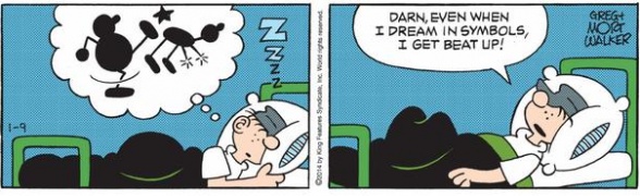
Going beyond the times a character speaks another language, there are less frequent times when a writer needs to convey something words just can’t express. Using a symbol to channel emotion can result in a more personal interpretation, allowing the reader to draw on their own experiences and connect with the character on a deeper level.

“Hawkeye” #11 was a lettering tour-de-force from Chris Eliopoulos. In the scene excerpted above, Pizza Dog’s emotions may not be held inside a speech bubble, but does that stop you from imagining the sounds in the scene? To me, the heart represents the deep sigh my dog let out when she was tired and would lay her head in my lap. The broken one is her whine when she realized I was done playing, or when I wouldn’t share my Little Debbie snack cakes with her. The mended heart is the heavy panting she made when I did share the treat, complete with the fast tail wagging. For all this talk, you may have imagined completely different but just as valid noises when you read these panels. And that’s the whole point.

In addition to having various personal interpretations, the very meaning of a symbol can also vary widely by context.
Take, for example, the cover to “Annihilation: Conquest: Starlord” #2, lettered by Russ Wooten. Consider briefly what you think Rocket’s saying. Sure everyone knows a skull and crossbones is shorthand for “Death”, but examine it a little closer. Rocket’s stance and cool expression indicate that he’s communicating a threat with a degree of calm and confidence usually reserved for Clint Eastwood movies. This isn’t a shout, it’s a mutter.
Continued below
Contrast it with this picture from “Teenage Mutant Ninja Turtles Adventures” #11, lettered by Gary Fields. This robotic foot soldier is shouting a skull and crossbones just before engaging the turtles in fight to the death. While there’s not room to show it all here, this is the only thing the foot soldier says, and he says it repeatedly right up until his (spoiler alert) destruction. This isn’t a threat – it’s a declaration. This was my first exposure to a symbol in a world balloon, and as a child, it confused the heck out of me. I had no idea how to interpret it. Sure, I knew it meant “Death”, but why didn’t the writer just put that? Was this laziness? As an adult, I hear this as somewhere between the mechanical screeching of a dial-up connection, and a high-pitched scare chord.
Lastly, there’s this one from Usagi Yojimbo, lettered by Stan Saki:
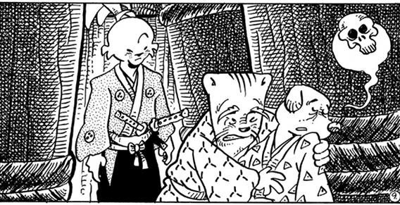
This one is completely different from the previous two examples, and not just because it’s missing crossbones. The “Guardians” and “TMNTA” skulls were different in tone, but both were a cry of death. Here, it represents the actual sound of dying. It’s a powerful image, and others have already written about it. No matter what sound you think this is representing, this is a case where plain onomatopoeia just wouldn’t suffice, and may even be counterproductive. Something like >sighgasp< might leave you thinking the character was still alive. Additional exposition could clear it up, but would ruin the ambiance of the scene.
These are by no means an exhaustive look at symbols in lettering, and the interpretations of what they might sound like if actually spoken are plainly subjective. If you have a favorite example that didn't make this list, or if you have a different idea of what these symbols might sound like, please share it in the comments!


