
The time has come during our celebration of lettering for a showcase of some particular lettering samples which merit discussion all on their own. By necessity, these selections will be limited and subjective, but hopefully they’re also varied and thorough. The first aspect to get the spotlight is word balloons. This isn’t going to be a rehash of Nate Piekos’ grammar page, which is a first rate breakdown of common bubbles. Instead, this will be some examples of less common balloons used in particularly effective ways.

Of all the many characters who qualify for their own special style of speech bubble, Thanos is one of the oldest and one of the best known. The extra thick boarder and rough edge to his balloons gives his words a deep, gravelly sound. To my internal ear, anyway. Maybe you hear him different. Whatever type of voice you think this visual describes, you can’t argue that it’s effective in making him sound different from whoever he’s sharing a panel with. But he didn’t always sound this way.

In his first appearance (“Iron Man” vol 1 #55, Feb 1973), there was nothing special about his balloons at all. He had to wait for his third appearance (“Captain Marvel” vol 1 #27, July 1973) for that, at which time his speech appeared in balloons with a green background. Both of these were lettered by John Costanza. It was only in “Captain Marvel” #28, lettered by Tom Orzechowski, that Thanos’ words received their rough edges. Orzechowski refined the design over subsequent issues of “Captain Marvel” and “Warlock” When the titan was resurrected in “Silver Surfer” vol 3 #34, Ken Bruzenak continued the style mostly unchanged. The advent of computer lettering allowed it to be further refined and codified, and Thanos’ voice has been mostly unchanged since the “Infinity Abyss” affair about a decade ago.
Any examination of special speech bubbles would be found wanting if it didn’t mention Todd Klein’s stellar work in “Sandman”. His skills helped bring life to Gaiman’s creations and helped link together the varied artistic styles during the series. Shoot, there were enough character-specific balloons in this series to fill this column. Delirium’s balloons especially stand out as effective. Giving her bubbles only a wavy shape wouldn’t have conveyed much, considering the number of other characters throughout the cast who qualified for it. The uneven baseline and varying height of words was a nice touch, but adding the swirling, changing background colors to it? Genius. It really added flavor to her already off-the-wall speech.

Now, to be fair, continuing this style of balloon shouldn’t reflect badly on Joe Rosen or other letterer who has put words in Speedball’s mouth over the years. A big part of being a good letterer is consistency, and changing a character’s bubble would be extremely noticeable. And it may not even be entirely on the first letterer to do it – Jack Morelli. Maybe Roger Stern’s script called for a “metallic, echoing bubble” and Morelli did the best he could. It wouldn’t be the first time a writer asked a letterer for something crazy. Unless one of them or someone else involved comes forward, the true origin will remain a mystery.
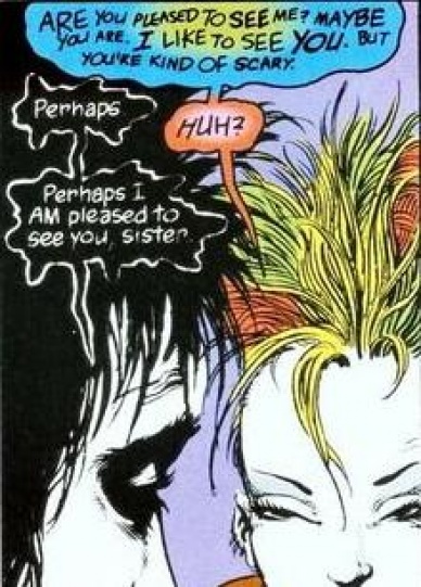
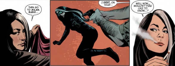
Character-specific balloons have another, less frequently used function: they’re helpful in scenes like the one from “New Warriors” vol 1 #22 shown above, where conversations continue without tails. The unique designs leave no doubt about who’s speaking. However, this effect is easy to overdo. During the ‘Heroes Return’ era of “Avengers” and “Fantastic 4,” it seemed every other character received a unique font or speech bubble. They’re all well considered and make sense, but the sheer number of them sometimes distracts from what they’re trying to convey. Readers noticed, and the letter column of “Avengers” #3 acknowledged the large number of complaints about Thor’s font. Here’s how it looked in issue 1:
Continued below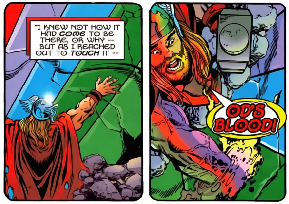
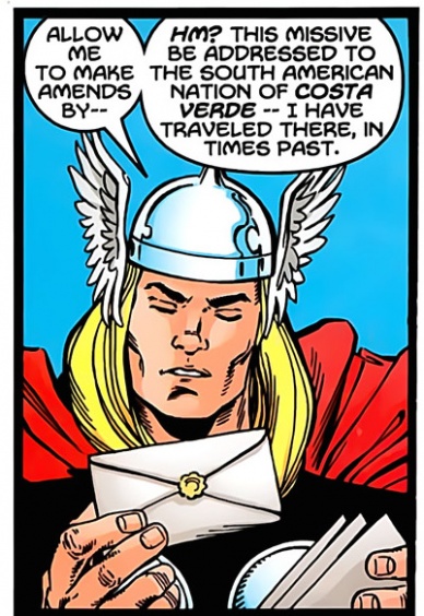
And here’s how it was changed in issue 5:
Like balloon shapes, though, too many font changes can be ruinous. For example, take a look at this ad for Hallmark:

There are three fonts for six words. It changes from mixed to caps to mixed and back again. The point sized grows and shrinks. Which word or words here are stands out the most to you? The focal word in this ad for a storybook should be Storytime, but the font groups it with is and for, the two least important words, while the word not gets all caps, a printed font, and bold. And what’s with that random dot? While there aren’t any comics which abuse letters like this, it’s proof that sometimes less really is more.

This is an effective device used to show a relationship between characters. In recent years, for instance, all the Skrulls in the Marvel Universe have spoken with a green balloon and a specific font. In a medium where a wandering eye can easily ruin a surprise, applying a group bubble to someone who doesn’t appear to belong to said group is a sneaky way to insert an “Oh, crap!” moment into a scene, like this one from “Secret Invasion” #1, lettered by Chris Elipoulos.
In addition to the characters who always get a particular balloon, there are countless emotional situations where a speaker gets a temporary bubble or font to emphasize their feelings. Most of the common styles, like the exploding shout balloon or the dashed whisper balloon, are covered by the link to the Blam Bot page up in the first paragraph. Here are two less common examples:

The first panel is from “Daredevil” vol 3 #35, lettered by Joe Caramagna. The icicle-like appendages hanging from the bottom of the balloon help convey the hero’s cold tone, expressing sarcasm where a traditional balloon would fail. The second is from “Powerpuff Girls” #5, lettered by Neil Uketake and Troy Little. The round, fluffy letters in the word love do more than show which word is being emphasized – it really sells Buttercup’s energy and joy. Can you imagine this with more standard lettering, where love is just the regular lettering italicized and bold? It’s not just this one excerpt, either. This series is still early in its run, but every issue so far has been an experimental playground of speech balloon, sound effects, and panel shapes which has excelled at capturing the energy of the cartoon.
There’s also the times when dialogue transcends the balloon boundary and enters the realm of pseudo-sound effect. You’ve seen this before, maybe when the villain’s failed plan backfires in a spectacular NOOOOOOOOO or when a heroine lets out a tortured scream AAAAAAHHHHHHHH. One of the most successful uses of this effect, though, is maniacal laughter. The sample to the right is from “The Killing Joke,” lettered by Richard Starking. The impact of lettering some HAHAs like this, to my internal ear, is a deep, guttural laugh that resonates and seems to fill a room. It’s an uncontrollable, hysterical sound that requires a particular visual to be convincing. Compare the Joker image to this one of Sinestro from “Green Lantern” #3, lettered by Sal Cipriano. Maybe it’s just me, but his posture and facial expression (not to mention the unpictured context) just don’t fit with the laughter as presented. A smaller heh or similar would be more appropriate.
.push({});
</script></div><hr/>align=)
To round out this discussion, let’s take a look at foreign languages. This is a tricky aspect of a silent medium. If the conversation isn’t critical to the plot, sometimes the words are put in without translation and act only as a bilingual bonus. But if the reader does need to know what’s being said, things get tougher. Because space is at such a premium, it’s not feasible to put the foreign words and their translation into the same panel. The two most common methods are to put the text in English with an editors note that it’s been translated from whichever language. The other it to surround the dialogue with chevrons, like in the above scene from “Y: The Last Man” #11, lettered by Clem Robbins.
These options aren’t perfect – placing chevrons around words isn’t intuitively understood. A reader either needs to be aware of their meaning prior to seeing them, or have exposition in the story explain it. Some writers, such as Kurt Busiek or Ed Brubaker, have publicly aired their disdain for them, and try to craft scripts in ways which avoid using them, to varying degrees of success. In “Velvet”, Brubaker is trying something new – using an italic font to represent a foreign language. It’s too early to determine how successful this method will be, but it’s as unintuitive as the more popular alternatives. The first attempt at it (“Velvet” #3, lettered by Chris Eliopoulos) required two notes in the book to alert the reader, and in my opinion the font wasn’t quite distinct enough from the regular lettering to stand out as being obviously different. Judge for yourself. Only one of these three is supposed to be English:
Letterer Deron Bennett also gets frustrated with the chevron convention, and came up with an innovative approach to it after being challenged by editor Rebecca Taylor. It’s currently appearing in “Hacktivist,” and I hope it catches on.

This is just a small selection of the thousands of notable word balloons. There’s probably a bubble or font style you find particularly effective that didn’t make this list. Or maybe you disagree with one of my interpretations for the above examples? This is definitely a subjective topic, so share your thoughts in the comments!


