
Got You Covered is back with another look at the best covers of the month. At the end of each month, we’ll be sharing the absolute best (in one writer’s mind) in comic covers for the month. Unlike before, they won’t be ranked, they’ll just be listed alphabetically with explanations as to why each is such a great example in the art of comic covers.
Share your thoughts in the comments about what were the best covers in the month, and thanks for reading.

All-New Ultimates #12
Art by David Nakayama
Some covers make this list for complicated reasons that take a lot of explanation. This cover from David Nakayama, whose work I had never experienced before, makes it for a much simpler one: it’s a nostalgic blast of pure awesomeness. Very few things remind me of my childhood more than the old “Where’s Waldo?” books, and this cover is a direct call back to those awesome books. It’s a great piece, generally speaking, but the concept is what sells me, and it sells me oh so well.

Elektra #10
Art by Mike Del Mundo
Another month, another coronation of Mike Del Mundo, as his latest cover for “Elektra” is an absolute stunner. It’s a cleverly designed piece, depicting the human weapon that is Elektra as she flies at a bullseye that both represents her deadliness and inability to miss her mark as well as the man she’s aiming at. It’s a great idea, but also something that’s remarkably well drawn. Simple. Elegant. Effective. It’s the Mike Del Mundo way.

Fables #148
Art by Nimit Malavia
Last month when I featured the cover to “Fables” #147, I mentioned how I’d love to have more from Nimit Malavia as this series winded down. Malavia’s work has impressed, and I was very pleased to see this cover looking up from me when I picked up my copy. It’s another superb piece, as Malavia uses varying hues of red to help deliver a more meaningful, impactful piece. In a way, Malavia’s linework reminds me of a more fine art like Olivier Coipel, and that’s a surprisingly effective idea. Bonus points go to the “Happily Ever After” icon on the bottom left part of the cover. That’s a wonderfully designed piece, and it’s a nice unifying element for the arc.

Fairest #33
Art by Adam Hughes
Adam Hughes is the best there is at what he does, and what he does is draw beautiful women. But that’s not all. While his Goldilocks is undeniably stunning and makes the piece work by itself, I love the cascading ghost red weaponry across the top of the piece. It’s a beautiful touch. While it may be ostensibly inessential to the piece, it’s something only an artist like Hughes adds to a cover that makes it that much better. This was a tremendous run by Hughes on covers, and there will be a hole in this column now that the book has ended.

Grayson #6
Art by Jock
I’m not typically fond of including variants in the mix, as generally speaking, I’m not a variant fan. However, great is great, and this cover from Jock that’s part of The Flash’s 75th anniversary cover celebration is great. While it plays on a lot of the things we love from Jock – his ability to really nail powerful Bat character moments (aka dives), the cleverly economical decisions he brings to the page, his usage of deep blacks – it also has a real crackling energy to it that we don’t always get. His Flash is a potent one, and the cover works mostly because of the power he delivers with the character. Excellent work by one of the best cover artists in comics.
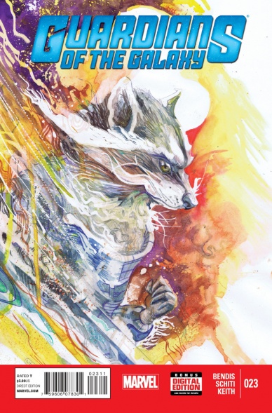
Guardians of the Galaxy #23
Art by Christian Ward
This is just a thrilling piece, and not just because it was originally created for Multiversity’s Bill Mantlo benefit and not just because I actually own the original. Christian Ward’s a phenomenally gifted artist, and this cover showcases some of the unique things he brings to the table as an artist. There’s an energy and vibrancy he can bring to what is, for all intents and purposes, a static medium that few possess, and you can really see that here. Rocket’s enveloped in all of that, and it results in a stunningly beautiful piece that speaks volumes about his capability. Plus, it’s hard not to love the symmetrical power of that Guardians titling, isn’t it?
Continued below
Rocket Raccoon #7
Art by Skottie Young
Speaking of Rocket, Skottie Young brings yet another cover to this book, but he handles it in a way we don’t normally see from him. Most of his cover work has pretty vibrant, full colors and fits into a pretty standard (but excellent) Skottie Young box. It’s cute even when it isn’t a typically cute book he’s covering, and that’s kind of his thing. That’s not a condemnation of his work, it’s just what we see from him given what he’s hired for. This cover though is much more subtle by design, as Rocket’s evidently on a planet covered in snow, and Young’s usage of snow to create a whiteout around and on the character makes the cover pop like crazy, even with the rather faded look to the character himself. It’s a beautiful look that makes the book stand out. It’s just a shame that Marvel always uses that red box at the bottom, as this cover would look even more amazing without it.

The Autumnlands: Tooth & Claw #3
Art by Skottie Young
Speaking of Young, here’s another great piece from him, as this variant cover shows off the adorableness we come to expect from him. This book actually can be quite brutal, but it’s rather disarmed by Young’s art, making it all the more inviting to pick up. Young’s work is infinitely charming, but many often forget that his eye for design and execution of his craft makes it stand out beyond just being cute. The way he uses white space here really stands out, as the titling and art lifts off the page even more because of it. Another fantastic piece from one of the best.

The Wicked + The Divine #7
Art by Jamie McKelvie
I don’t know about you, but I always wished that Daft Punk was featured in more of my comics. Thankfully, Jamie McKelvie delivers with this cover, and my wish has now been granted. What’s that? That’s not one of the members of Daft Punk? It’s Woden, one of the gods from the book? No matter. It’s a beautiful cover no less, amusingly reminding me of Tron amidst its Daft Punk parallels. WicDiv perpetually makes this list, and it’s all because of McKelvie’s tremendous abilities as a designer and character artist, the work of the whole team in creating the WicDiv cover layout, and Matt Wilson’s beautiful colors. Well done, once again.
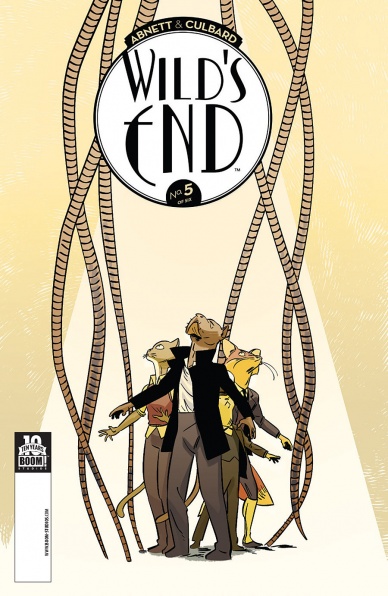
Wild’s End #5
Art by I.N.J. Culbard
First things first. MC commenter Nicki shared the name of the person who does the design work on this book, and her name is Kara Leopard. Kara Leopard, you do remarkable work, and you are the unsung hero of this tremendous book, elevating something that’s already great into something even more. That’s not to diminish I.N.J. Culbard’s work, but his art is so beautifully complemented by Leopard’s design that these covers are perpetually amongst my favorites. I love everything about them, and this one, which features our heroes encircled by danger, might be the best one yet. Culbard and Leopard, keep up the amazing work.


