

It’s another week of comics, so we have a look at the best in covers. After last week’s extravaganza, this week is a bit more subdued…but still awesome! Check out my picks below.

Art by Blur Studios
Normally, I wouldn’t include something like this if only because it isn’t really comic art per se. It’s CGI. That said, this is a damn fine cover in the fact that it gets the character incredibly well. This is as iconic of an image of The Goon as there is, all steeped and shadows filled with cartoonish brawn and real violence, with blood smudging his shirt on his shoulder. This is the company that is (was?) developing an animated version of the book, and if this is any indicator, they are going to rock the freaking house.

Art by Mike Allred
I’d get more complicated for this one, but come on, some things are simple. Doop + Doop speak + Wolverine responding to it + Mike Allred art = magic. You just can’t go wrong with it. Plus, it’s Doop in a freaking Wolverine costume.

Art by Dave Johnson
What’s that? A Dave Johnson cover made my list? That’s SO shocking! Okay, maybe it isn’t, but there is a reason why he always makes the cut: he’s freaking fantastic. In fact, I’ve loved all of his Fury MAX covers, as they do a superb job of blending three different styles into one instantly recognizable image. They remind me of Mitch Gerads’ covers for The Activity, bridging the graphic work with comic art and pitch perfect titling. This does the same, and I love the usage of the torn up Bay of Pigs postcard. It’s brilliant, and jives well with the beaten up (but not beaten!) image of Fury at the top. Johnson is a master at telling a story on a cover, and this does that very well.

Art by Rodin Esquejo
Rodin Esquejo has certainly come out strong as an interior artist on MtG, but I’d be lying if I said I preferred him as anything but a cover artist. This is a perfect example of why that is. Not only is it a gorgeous image with stellar character work on it (I love the direction of Elle’s face and her mother’s dragon lady – words from MtG #1, not mine – glare), but little touches make it stand out all the more. The way the crack in the glass centers around Elle to heighten the focus on her in the image is exceptional, but my favorite part? The way the frame is rotated to a slight diagonal on the cover, as if Esquejo and writer Jim McCann wanted to say, “something isn’t what it seems here.” It’s a nice little touch, and it adds volumes of power to an already strong image.

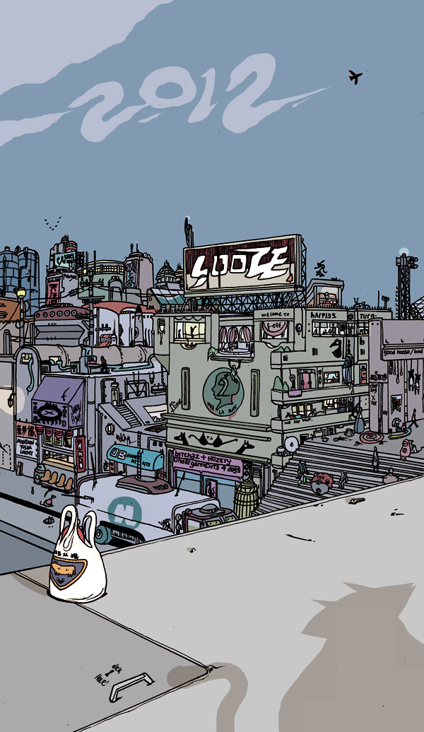
Art by Brandon Graham
While I’d be lying if I said that it didn’t remind me a little of the King City teaser from earlier this year (just in how it angles off the roof and displays the city), this is still another wonderful example of Brandon Graham’s art. Just look around the page and drink in the details. Even if you just focus on the dining area, there are all kinds of fun bits, but when you expand out you can see the world he creates in the process. For me, one of the best things Graham does is he makes your mind fill in the gaps in the world. I immediately start imagining the rest of the building the characters are upon, what’s down the street below, etc. etc. And it’s just because of his exceptional imagination that this happens – he pushes readers to want more.
And all of that with a cover. That’s saying something. The guy is one of the best, and this is just another example of that.


