
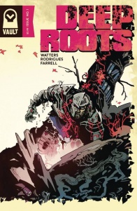
When Vault Comics pitched this book as part Dark Souls, I was immediately intrigued. Even when Vault Comics simply released the cover for “Deep Roots” #1, I caught myself looking twice. This is a comic that oozes intrigue on the stands, and begs for you to delve into it. But is the story underneath the mystery just as compelling?
Written by Dan Watters
Illustrated by Val Rodrigues
Colored by Triona Farrell
Lettered by Aditya BidikarRoots, once suffocating under cement, tear through the streets of London to throttle buildings. Vegetable homunculi hold up banks with automatic weapons. There is a green and blooming world beyond our own, fighting back against the human pollutant. We will launch a rescue mission to this Otherworld. But it is cruel and unknowable, and should we become tangled in its vines, more than cities will fall.
From Dan Watters (Limbo, The Shadow, Assassin’s Creed) and Val Rodrigues comes a story of two worlds, of myth and man, of science and fiction, and the roots they share.
I’m always interested in stories as genre blenders, how they work, and how they work successfully. At face value, “Deep Roots” #1 looks like a classic high fantasy tale, complete with knights and sweeping green landscapes. But turn to the third page, and you’ll see said knight surveying the land littered with soft drink cans and a ‘chuckles’ bar wrapper. It’s a great way to catch the reader unaware, before shifting into a modern setting, which is in turn informed by the environmental devastation theme before it. What’s more is the way it plays with reader expectations, setting up potential protagonists in vegetable-people bank heists before completely disregarding them. It’s a great usage of genre, considering a fantasy element might call for a clear-cut protagonist, but Watters quickly discards this idea to keep us on our toes. It’s clever two-pronged storytelling that works well at merging seperate paths into one unique narrative.
Something I’m not typically a fan of, however, is old-school comicky omniscient narration. I’ve always been a firm believer that comics should be able to visually lead readers through the story without the secondary hand-holding of the all-knowing voice. The narration here comes across like this initially, but Watters uses it more as a supplement, working in tandem with the visuals so that it doesn’t feel like narrative re-treading. It compliments Watters’s casual dismissal of protagonists, such as telling readers that Tom the bank teller has worked in his job for two years, and that his parents will have him buried in an eco-friendly coffin before swiftly killing him off with a bullet to the forehead. Even better, we get suckered in a second time, spending more time with the headstrong Sal, who seems to look the part for a story lead as the narration tells us all about his experience as a war veteran and subsequent PTSD, before, yes, disposing of him too. However, the narration doesn’t work as well when it genuinely tries to convey story. The scene with the Sentinel’s awakening, while effective, could have afforded to pair back the descriptions to keep things more tonally interesting. Nonetheless, Watters uses the narration smartly to attach us to these characters in the middle of visual storytelling, cleverly tricking us and subverting expectations.
With any text involving fantasy, one must assume there is a fantastical lore and interesting characters behind it all, and Watters goes all out on both. There’s no falling into the trap of over-explaining or excessively world building in the first issue, the most we get is in the narration in the Sentinel’s awakening scene. Even then, Watters plays it cool, only referring to a ‘great battle’ the Sentinel participated in, bringing up concepts for us to speculate on such as the ‘evergreen otherworld’ and ‘creatures of folklore.’ Watters feeds us more intriguing information by having the Sentinel interact with ‘Jenny Greenteeth,’ building up his bestiary by having her refer to ‘invaders,’ introducing the concept of ‘other worlds’ and calling the Sentinel a monster. There’s a lot of implications here for hungry minds to latch onto, and to keep readers following from issue to issue.
Continued belowVal Rodrigues handles art here in a unique and stunning way. The story is divided into two genres and worlds, so naturally Rodrigues adapts this with two different art styles, both stylised for each narratives themes and aesthetic. The first we see, the setting of the Sentinel’s ‘otherworld’ in his awakening scene, is an intricate blend of inks and painterly style. Then, we switch to the modern world, in which Rodrigues uses tighter inks, and more clean-cut pencilling on the environments. It’s a good way to distinguish scenes and keep them tonally unique, but works even better when the two co-appear to create a mishmash of varied aesthetic. For instance, in the bank heist scene, the vegetable-people are rendered with the otherworldly aesthetic, while the rest of the environment is tight and modern inked cel shading. It suggests to our brains, aside from the fact that these are vegetable people, that tonally these characters don’t seem to fit with the surrounding environs. This occurs a few more times, to the greatest effect involving our friend Sal, a double decker bus and a sprawling, twisting otherworld oak (I’ll let you fill in the details or read for yourself).
What makes this comic feel unique is how Rodrigues’s sequential work feels weighted and elegant. Every movement a character takes feels deliberate and smooth, not frantically jumping from panel to panel but striding purposefully so that the reader’s eye follows with pendulum-like motion down the page. From the second page, we get this, with the Rodrigues depicting the Sentinel erupting as a growth from the foliage, before steadily dropping to one knee in a sweeping, commanding motion. Even in the bank heist, something commonly associated with high stakes and blood pumping speed, the vegetable people move with eerily elastic grace, while everyone’s favourite, Sal, springs across panel to panel with relative ease, clutching the veggie people’s throats before deftly taking a machine gun to their heads. But it’s not just the characters that emulate this feeling, it also occurs in the frames and textures of the art. The spectacular double-page spread of the otherworld occurring after the heist has a fantastic sense of motion conveyed through Rodrigues’ brushstrokes, pushing the oaken roots through the page with a slow unveiling of each scene between the branches. It works well with the mysterious yet inviting tone of the narrative, and is breathtaking to watch unfold.
Triona Farrell’s colors are a big part of this issue, as they make the otherworld segments pop with psychedelia and the modern world segments feel like a warm dusk outside your window. Farrell brings another layer of complexity and style to the otherworld segments, painting expressionist brushes through each scene, making the Sentinel’s golden armour glimmer with ancient pride, and making the double-page spread look like a van Gogh piece. But the smaller sections, as stated, have a day-glo warmth to them, like the scene of Sal riding public transport stands poised tastefully against a pink/orange textured gradient. Farrell knows they’re meant to contrast extremely against the otherworld, yet still finds ways to make each scene look as inviting as it is realistic.
“Deep Roots” #1 is a fantastic debut for Vault Comics. Watters subverts your expectations and plays with your emotions like a master puppeteer, mixing fantasy and modernism to create an exhilarating and original story. Rodrigues and Farrell slay on art, delivering two distinct aesthetics that look visually striking and simultaneously cohesive together. It’s the fantasy comic I never knew I wanted to follow.
Final Score: 9.0 – “Deep Roots” #1 is a compelling debut, combining dark fantasy with modern action drama and brought to life with two distinctly striking art styles.


